Which correlation method to use for my continuous data? Pearson’s correlation or a robust correlation method to account for outliers or non-normality? A while ago, I wrote an R script to flexibly apply the correlation method based on the data at hand. I have found this script very useful for myself. So, I decided to share it with others. I hope you find it helpful too!
The script is available from my GitHub repository. Below is a description and examples notebook. You can also launch an interactive notebook via Binder.
Let me know if you spot any problem either in the code or in my three rules of choosing the correlation method!
![]()
![]()
Which correlation method to use?
Pearson's correlation is the most popular for continuous data. However, if data has outliers or does not meet the normality assumption, Pearson's correlation is inappropriate. Instead, one should use robust correlation methods, for example, Spearman skipped or percentage-bend correlation. On the other hand, if data is normally distributed and has no outliers, Pearson's correlation gives more power. Here I provide an R-script that first inspects the data for outliers (boxplot/bagplot method) and normality (Henze-Zirkler test) and then chooses the most appropriate of the three correlation methods. Based on Pernet et al. (2013), I follow three simple rules for selecting the correlation method:
- Pearson's correlation: Data is normally distributed and has no outliers
- Spearman skipped correlation: Data has bi-variate outliers
- Using the minimum covariance determinant (MCD) estimator
- (20%) Percentage-bend correlation: Data has no bi-variate outliers but is not normally distributed or has univariate outliers
The 'Flexible Correlation' script is available from my GitHub repository.
Function description
flexible_correlations.r script contains three functions.
1. check_data
check_data function checks data outliers and normality. It uses the boxplot method to check for univariate outliers, bagplot method for bi-variate outliers, and Henze-Zirkler test for bi-variate normality.
Input
check_data(var1, var2,
    var1name = "var1",
    var2name = "var2",
    var1ylab = "",
    var2ylab = "",
    disp = FALSE)
- Required
var1andvar2are numerical vectors; the two continuous variables you want to correlate.
- Optional
var1nameandvar2nameare strings; names of the variables to be displayed on boxplots. The default is "var1" and "var2".var1ylabandvar2ylabare strings; y-axis labels for the two variables to be displayed on boxplots. The defaults are empty strings.dispis logical. Whether you want to display the assumption check results (boxplots, bagplot,q-q plot). The default isFALSE.
Output
A 4-item list:
outliers_all: All outlier cases; a numeric vectoroutliers_uni: Univariate outlier cases; a numeric vectoroutliers_bi: Bi-variate outlier cases; a numeric vectornormality: Whether data is bi-variat normal; TRUE/FALSE
If attribute disp = TRUE then summary text will be outputed and 4 plots displayed: 2 boxplots, a bagplot, and q-qplot.
The output is used by the other two functions, do_correlation and plot_correlation.
2. do_correlation
do_correlation function performs one of the three correlation methods. It uses the number of univariate and bi-variate outliers obtained from the check_data function. It performs the Henze-Zirkler test to determine whether the data meet bi-variate normal distribution.
Input
do_correlation(var1, var2,
    data_check = NULL)
- Required
var1andvar2are numerical vectors; the two continuous variables you want to correlate.
- Optional
data_checkis the list of data check results. If not provided, thencheck_datafunction will be executed to get the outlier list.
Output
A 3-item list:
txt: Correlation results in the form to be displayed on the correlation plot.p: A p-value of the correlation.datainfo: Information whether data has otliers and is normally distributed.
The output is used by the plot_correlation function.
3. plot_correlation
plot_correlation function displays a scatterplot, trend line with shaded 95%CI, and correlation results in a text form at the top.
Input
plot_correlation(var1, var2,
    var1name = "var1",
    var2name = "var2",
    corr_results = NULL,
    data_check = NULL,
    pointsize = 1.8,
    txtsize = 11,
    plotoutliers = FALSE,
    pthreshold = NULL,
    datainfo = TRUE)
- Required
var1andvar2are numerical vectors; the two continuous variables you want to correlate.
- Optional
var1nameandvar2nameare strings; names of the variables to be displayed on boxplots. The default is "var1" and "var2".corr_resultsis the correlation results from the functiondo_correlation. If not provided, thedo_correlationfunction will be executed to get the results.data_checkis the list of data check results. If not provided, thencheck_datafunction will be executed to get the outlier list.pointsizeis numeric; the size of the scatterplot points. The default is 1.8.txtsizeis numeric; the font size of the scatterplot labels. The default is 11. The title size would be 2 points larger.plotoutliersis logical. Whether to plot outlier cases on the scatterplot. The default isFALSE.pthresholdis numeric; a p-value threshold for statistically significant correlation. If provided, a red box will be displayed around the scaterplot and the result text will be displayed in bold.datainfois logical. Whether to display data summary information about outliers and normality. The information would be displayed in the plot camption. The default isTRUE.
Output
A correlation scatterplot with result text at the top.
source("https://raw.githubusercontent.com/dcdace/R_functions/main/flexible-correlations/flexible_correlations.r")
A standart correlation plot
Let's use the R built-in dataset mtcars and look at the correlation between automobile weight and fuel consumption.
# plot size for jupyter notebook
options(repr.plot.width = 5, repr.plot.height = 3, repr.plot.res = 200)

# get the dataset
df <- mtcars
# plot the result
plot_correlation(df$wt, df$mpg,
                 var1name = "Weight (1000 lbs)",
                 var2name = "Miles/(US) gallon")

We see that Spareman skipped correlation was performed, and it was significant. We also see that there were two outliers in the data, and data did not meet bi-variate normality.
A plot with outliers displayed
You can also display the outlier cases on the scatterplot if you like. And you can also remove the data assumption summary from the bottom.
# plot the result, including outlier cases
plot_correlation(df$wt, df$mpg,
                 var1name = "Weight (1000 lbs)",
                 var2name = "Miles/(US) gallon",
                 plotoutliers = TRUE,
                 datainfo = FALSE)

Inspecting outliers and normality
You might want to inspect the data outliers and normality distribution more closely. For that, you can run the check_data function with disp = TRUE setting.
# plot size for jupyter notebook
options(repr.plot.width = 10, repr.plot.height = 3, repr.plot.res = 200)

# run assumption check function
check_data(df$wt, df$mpg,
             var1name = "Weight (1000 lbs)",
             var2name = "Miles/(US) gallon",
             disp = TRUE)
Weight (1000 lbs) outlier cases(n=2): 16,17
Miles/(US) gallon outlier cases(n=0):
Bi-variate outlier cases(n=1): 17

Henze-Zirkler test for Multivariate Normality:
Data are not bi-variate normal(HZ = 0.97, p = 0.02)
- $outliers_all
-
- 16
- 17
- 17
- $outliers_uni
-
- 16
- 17
- $outliers_bi
- 17
- $normality
- FALSE

We see that there were two outliers in the 'weight' variable, no outliers in the 'fuel consumption' variable, and one bi-variate outlier. The robust Spearman skipped correlation is most appropriate because of the bi-variate outlier in the data.
Multiple correlation plots
I have found this 'flexible correlation' script particularly handy for explorations, looking at several correlations together.
# To bind plots together, I will use gridExtra package
# Install and load gridExtra
if (length(find.package("gridExtra", quiet = TRUE)) == 0) {
  install.packages("gridExtra", dependencies = TRUE)
  library(gridExtra)
}
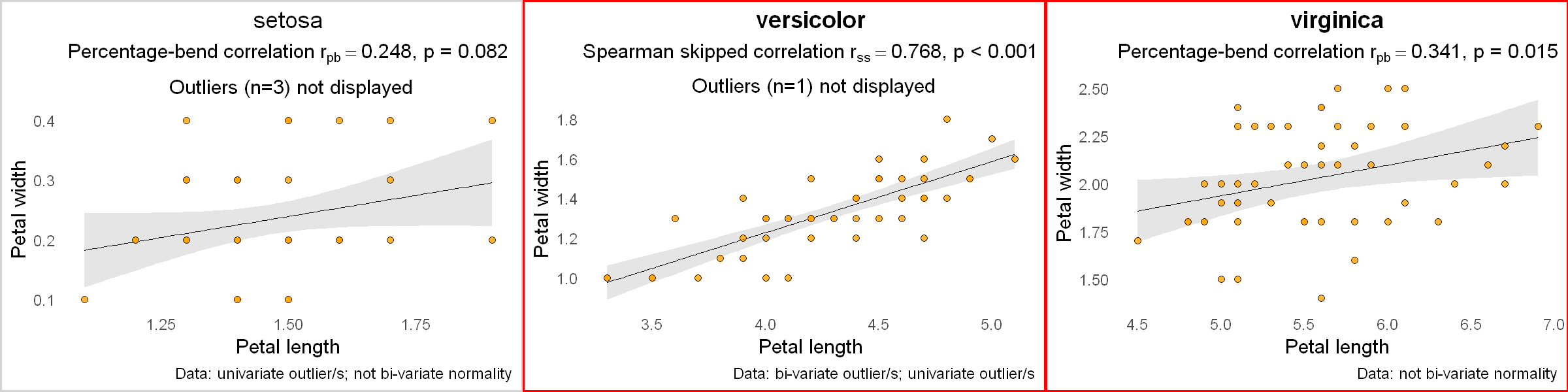
As an example, let's look at another R built-in dataset iris and correlate the petal length and petal width for each species of Iris flower.
# plot size for jupyter notebook
options(repr.plot.width = 12, repr.plot.height = 3)

# get the dataset
df <- iris
# get the species types and how many they are
iris.species <- levels(df$Species)
nspecies <- length(iris.species)
# create an empty list where plots will be stored
plotlist <- list()
# for each species type, plot the correlation
for (i in 1:nspecies) {
  ds <- subset(df, df$Species == iris.species[i]) # a subset data for this species
  p <- plot_correlation(ds$Petal.Length, ds$Petal.Width,
                        var1name = "Petal length", var2name = "Petal width",
                        pthreshold = 0.05 / nspecies, # p-value threshold, accounting for multiple comparisons
                       datainfo = TRUE) +
    labs(title = iris.species[i]) # add species name as a title for each plot

  plotlist[[i]] <- p # add this plot to the plotlist
}
# display the plots
gridExtra::grid.arrange(grobs = plotlist, nrow = 1)
